Specialization
It was April 12th, a Tuesday, and I just had one of those moments — the kind where your brain fires before your common sense catches up. I’d been wanting to build an app, an agent, something — but every idea stalled at the “thinking about it” stage, never making it to an actual folder on my desktop. Then a college roommate said something that snapped me out of it —
Every serious project started as a toy.
And honestly? He was right. I used to laugh at people who built budget trackers and todo apps. Boring, I thought. But now, with a quiet feeling that my current job might not last much longer, I figured — start with a blog. Give people a way to find you. Give yourself a reason to show up.
I was scared I’d procrastinate, so I opened a new folder that same day and just started. One week later, on April 19th, the site was done. April 20th I bought a domain. After a few hours of DNS review, at 1am on April 21st, my site went live.
While building it, I kept thinking I should write about the process — because even something as “simple” as a personal blog had way more gotchas than I expected. After launch, a friend (non-tech) sent me a Bilibili link: “This guy built one in ten minutes. Why did you take a week?” I started typing a reply — I have a design language, not a template; I wanted more flexibility than a framework gives you; and… I just stopped. Better to write it down instead.
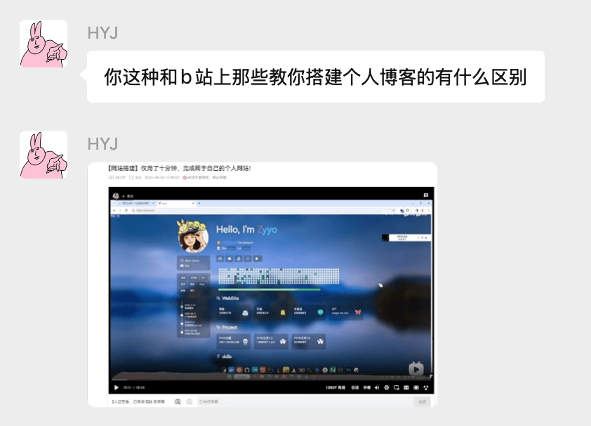
Fig 1: My friend raising the question.
From Zero to Live in a Week
Back when gpt-5.3 was the benchmark, the community consensus on frontend aesthetics ranked models roughly as: gemini3 > opus4.6 >> codex. And yeah, that gap was significant. But gemini3 had rate-limiting issues through most proxies, and opus4.6 was expensive enough to make you wince. So I went with codex — partly because I already used it at work. By the time 5.4 dropped (about two months in by now), with the skill system getting stronger, I figured codex could handle a small site just fine. I set up the folder, opened Cursor, loaded the superpower and front-design skills into the project, and stared at a blank canvas. What did I actually want this thing to look like?
At the time, “harness engineer” was everywhere. I didn’t want to wade through the recycled takes flooding Chinese tech media, so I went straight to the source — the Anthropic and OpenAI blogs. Anthropic’s blog stopped me cold. Clean, simple, but genuinely elegant. I had a tab of it open that I hadn’t finished reading, and right then I decided: that’s the vibe. I sent the page to gpt-5.4 and asked it to describe the design language. It came back with: restrained, minimal — and one word that nailed it: editorial.
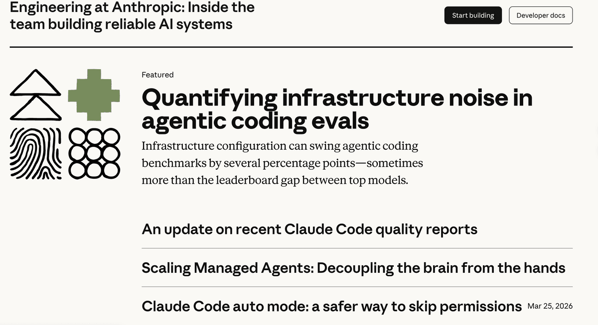
Fig 2: The Anthropic blog page.
Working with superpower on the frontend was genuinely fun. During the design phase it brainstorms, spins up a local port, and shows you a live preview — then asks if that’s the direction you want. I didn’t screenshot much during my own build, so here’s a demo from another project to show you how it works.

Fig 3: superpower spins up a port to preview the design.
Click through and you can see the style it’s going for.
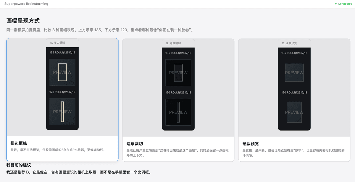
Fig 4: The preview in the browser.
It’s a back-and-forth — you answer its questions, it locks in the constraints, produces a plan, and then just starts building. The early stages went surprisingly smoothly. The overall structure came together fast, the design direction was set, and I thought the rest — filling in the pages, polishing the details — would be straightforward.
The Devil’s in the Details
Once the skeleton was in place, I started filling things out. The Articles and About pages were easy — simple display pages, minimal requirements, codex knocked them out without a hitch. But the Notes page and the Photos page were a different story.
A typical blog is just posts and a headshot. But I’d seen some developer’s site once — I can’t remember whose — that had a section for “passing thoughts”: short observations, quotes, little ideas. I loved it. I wanted that. So the Notes page was born. And since I genuinely enjoy taking mediocre photos, I needed somewhere to put them. Hence the Photos page.
For Notes, I got inspired by godly — seriously, go look at it, the infinite canvas concept is stunning. I wanted something in that spirit but more my style: a corkboard, with sticky notes pinned to it. If I had to point to a reference, it’s kind of like the investigation board in Alan Wake II.
The problem was I couldn’t describe it. I didn’t even know the term “infinite canvas” until I asked an AI. All I could say was: a background that moves, with sticky notes on it.
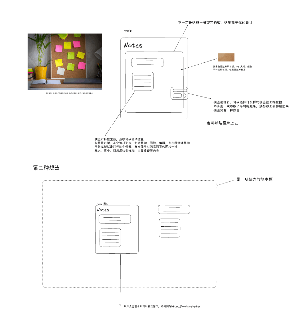
Fig 5: The Notes page design.
That’s when codex started losing the plot. It kept generating card layouts — the same ugly wooden board slapped on the screen, over and over. It seemed locked inside some container that was baked into the site template, and no matter what I tried, it refused to break out. I even screenshotted the issue and drew red boxes around it. Nothing.
I started wondering if the design history in the conversation was anchoring it — like it was always treating the first version as ground truth. So I opened a fresh session, looked up “infinite canvas” on the web to get the right vocabulary, and re-explained everything from scratch.
I told it the Notes page was a special case — it shouldn’t share the global template. That got it to fill the screen, at least. But it was still ugly. The color blocks were flat and heavy, nothing like the cork texture I had in mind. gpt-5.4 just couldn’t render that kind of material feel. After seven or eight rounds of back-and-forth I realized I was stuck in a dead end. I cut my losses, opened a new session, changed direction entirely — and happened to notice the grid paper background in my Obsidian setup. That became the new concept, and that’s what shipped.
This whole experience gave me a realization: when either you or the AI gets tunnel vision, someone has to step back and start fresh — otherwise you’re both just walking further down a path that goes nowhere. The destination looks right, but you can’t get there from here. And we all know the AI will never be the one to step back. It’s locked in its context window. Even if you say “try something different,” it’s still anchored to everything you said before — just taking a different wrong turn from the same intersection.
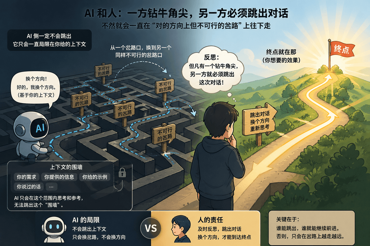
Fig 6: A reflection on tunnel vision when working with AI (AI-generated illustration).
I still had faith in codex at this point. The Notes page was a headache, but we got there. What finally made me think “codex, you just can’t do frontend” was the Photos page.
I wanted a clean masonry photo gallery. What codex gave me looked like — you know that feeling when you glance at something and immediately think, “an AI made this”? No soul. Rigid layout. Default spacing everywhere. This is the same model that handles complex backend logic without blinking — how is it this stubborn about a photo grid? It was genuinely bad, and I started thinking this wasn’t a me problem anymore.
Let me clarify something here, because it matters: when people talk about an LLM’s “frontend ability,” they don’t mean whether it can write code that runs — they mean whether it can design something that looks good. Any major model today can produce frontend code that doesn’t throw errors. The real question is: given the same prompt, the same skill, the same reference image — whose output actually looks better?
So I tried something. I opened the web version of Gemini — the nerfed, rate-limited version that everyone jokes about — and gave it the same brief. Three rounds of conversation. The result made me stop and stare. Then I copied that code, opened a new Cursor window, fed it to codex, and said: just follow this. After several more rounds of nudging, it finally got close to what I wanted.
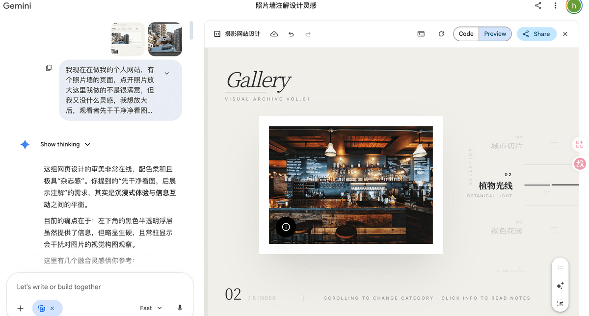
Fig 7: Even the web version of Gemini produced great frontend results in just three rounds.
Around this time, something funny happened — the algorithm must have been paying attention, because Bilibili pushed me a video titled something like “Why I stopped using GPT-5.4 for frontend.” The creator had been using codex + gpt-5.4 for a personal site, getting terrible results, and assuming it was their own fault. They read GPT’s own blog posts about it, watched the official tutorials, followed best practices — and still couldn’t figure out why it looked so bad. It wasn’t until they watched a video by another creator (Theo) that it clicked: this is a GPT problem, not a user problem.
The creator’s breakdown of the issue:
- Aesthetically stuck and generic: GPT’s frontend output is almost always the same — card-heavy layouts, oversized serif headings, filler text everywhere.
- Immune to correction: No matter how you push back, GPT holds its ground. Even with explicit skill prompts, reference images, and official best practices, it just keeps doing its thing.
That explained everything. Even with a dedicated frontend design skill loaded in, the output was still bad.
Specialization
Which got me thinking: every major lab is racing to build the all-capable LLM — but why? Why not go deep on one thing instead? I still remember when Gemini 3 first dropped and the whole internet was showing off web UIs built with it. Stunning variety, genuinely surprising results from plain-language prompts. I don’t fully understand fine-tuning, but the basic idea is making a model more like what you want it to be. So why not lean into that — each lab picking a lane and owning it?
Small easter egg: I originally had no idea what to write for Claude. I don't use it much — it's expensive, and while it's clearly capable, I couldn't think of something as vivid as "Gemini for frontend" or "GPT for backend." So I wrote "couldn't think of anything." Then I used Claude Code to edit this post — and the thing wrote itself in.
Specialization might actually prevent any single AI company from monopolizing the space. Maybe each lab just needs to go deeper on one thing — fine-tune hard in one direction, and own it.
Fig 8: The bit where all the labs recommend each other.
You might say: that’s dumb — instead of paying one subscription, now you’re paying three? Maybe. Though I imagine the VCs see it differently: it used to all be my money, and now I have to share?
The site shipped, wobbly as it was. A few things I’d do differently:
Oh, and one hard-won lesson: don’t play a high-APM game (MOBA, FPS) while the AI is running. You finish a match, look back at your screen, and the AI finished ten seconds ago — it’s just been sitting there waiting for you.